



Director Turns Stationery Into an Art Form
Most people treat stationery as an afterthought. Sofia Coppola treats it like a wardrobe.
The Oscar-winning director behind Lost in Translation, Marie Antoinette, and The Virgin Suicides is famous for turning everyday objects into statements of beauty. And her stationery collection — yes, she has a collection — is no different.
In a 2014 feature for W Magazine, Coppola laid it all out plainly: “Stationery is one of my biggest indulgences.” She went on to explain that she keeps different sets to suit her mood or the occasion. Her words: “I like to think it’s okay to have a wardrobe of stationery.”
A wardrobe. Of paper. That is peak Sofia Coppola.
This article breaks down her actual stationery choices, the brands she loves, and why her paper aesthetic has become a whole cultural moment that people on TikTok and Instagram are still trying to copy.
What Sofia Coppola’s Stationery Collection Actually Looks Like
Let’s start with the real stuff — no guessing, no romanticizing (well, maybe a little).
According to her W Magazine piece, Coppola’s stationery collection spans several Parisian houses and London favorites:
- Benneton Graveur (Paris) — Her cursive name and her daughter’s birth announcement
- Olivier de Sercey (Paris, rue du Bac) — Her everyday go-to near her apartment
- Smythson of Bond Street (London) — Monogrammed cards with hot pink-lined envelopes
- Mrs. John L. Strong (New York) — Cherry note cards
- Louis Vuitton — Custom stationery (yes, really)
She even mentioned that Marc Jacobs, her longtime friend and collaborator, had a drawing of his dogs made into custom stationery at Benneton Graveur. These are not people who treat paper lightly.
Source: W Magazine — “Note Well” by Sofia Coppola (2014)
Benneton Graveur: The Parisian House at the Heart of It All
If there is one name that runs through Sofia Coppola’s stationery story, it is Benneton Graveur.
Founded in Paris in 1880 by Emile Benneton, this legendary stationer is known for brushed stamping, colored edges, and certified envelopes. It is the kind of place where you don’t just buy a notecard — you commission one.
Coppola discovered Benneton Graveur while living in Paris on the rue du Bac. She ordered her address in cursive script, then came back for her first daughter’s birth announcement. Then she came back again.
That is how these things work with people who genuinely love beautiful paper.
You can explore Benneton Graveur’s work at bennetongraveur.com. American clients can order via email directly from the atelier.
Smythson: The Quiet Luxury Choice
No conversation about Sofia Coppola stationery is complete without Smythson of Bond Street.
Founded in London in 1887 by Frank Smythson, the brand is a holder of three Royal Warrants. Coppola ordered monogrammed cards from Smythson — and chose envelopes lined in hot pink tissue. That detail says everything. Understated on the outside, unexpectedly joyful on the inside. Very her.
Smythson is available at smythson.com. Their notecards typically run around $45 for a set of 10, which is luxury pricing but not “I need a second mortgage” territory.
The Important Flowers Planner: Her Stationery Aesthetic Goes Public
Here is where it gets even more interesting.
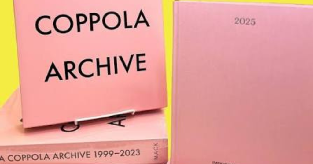
In late 2024, Coppola launched Important Flowers, her own publishing imprint under Mack Books. The debut release included a 2025 planner — pink, personal, and inspired by her own diary. It sold out almost instantly.
According to Fashionista’s coverage, the planner featured monthly and weekly spreads, a resolution log, notes pages, and wish lists for hotels, restaurants, movies, and books. It came with a handwritten note inside.
It priced at $30 and people were absolutely frantic about it. The 2026 version is available for pre-order — but fair warning, it’s not pink.
This move was not random. It is entirely consistent with who she is. Coppola has spent decades turning personal aesthetic choices into cultural touchstones.
Why Sofia Coppola’s Aesthetic Has Taken Over the Internet
You cannot talk about her stationery without understanding the broader cultural moment happening around her name.
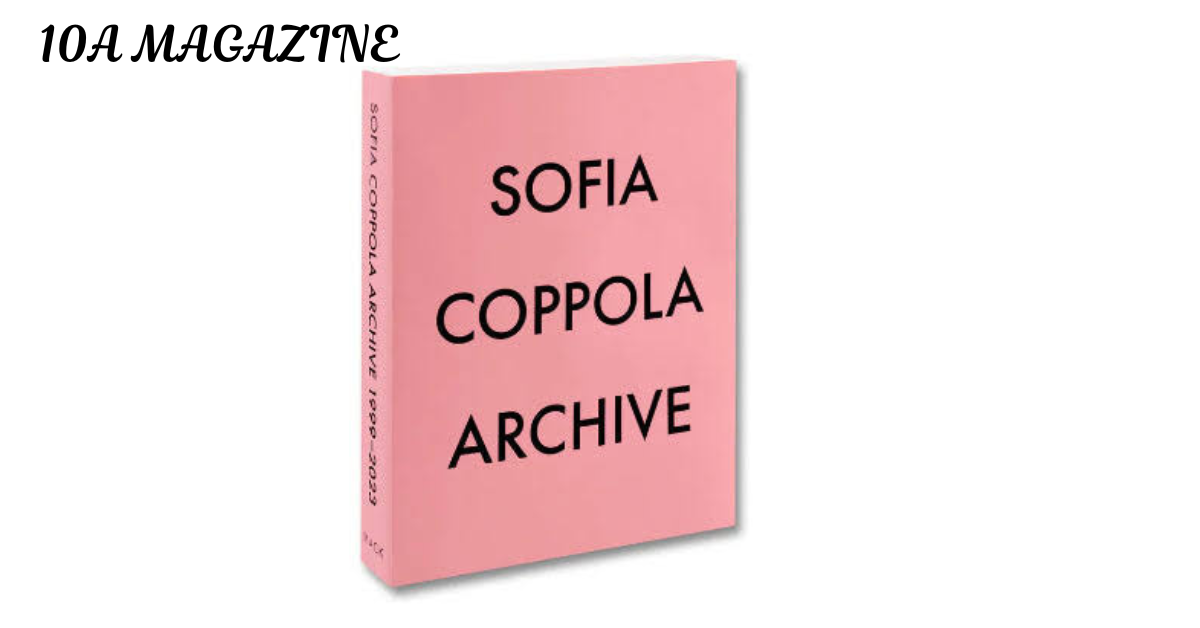
The release of her book Sofia Coppola Archive: 1993–2023 in 2023 sparked what people online began calling “Coppolacore” and “the Coppola effect.” As noted by Who What Wear, social media filled up with imagery of girlhood, femininity, and quiet beauty — all filtered through a very Coppolan rose-colored lens.
Her film title sequences have also played into this. As explored in depth by writer Jenn Richter on Medium, Coppola’s early collaborations with designer Peter Miles defined a visual language built on Copperplate Script — once associated with old-world masculine prestige, now reframed as something delicate, feminine, and distinctly hers.
Her typography choices. Her film palettes. Her stationery. It all connects.
The Polyester magazine interview from 2024 put it well: Coppola gave people the visual language to romanticize their own lives — to curate their shelves, photograph them, and share them. The stationery piece of that story is not small. It is a physical expression of the same impulse.
Source: Polyester — Sofia Coppola interview (2024)
The Color Palette Behind the Paper
Sofia Coppola’s stationery choices are not random. They follow the same visual logic as her films.
Think soft neutrals. Dusty pinks. Creamy whites. The hot pink Smythson envelope lining is a surprise — but it is a controlled surprise, like the pair of Converse sneakers hidden beneath Marie Antoinette’s eighteenth-century gown. That anachronism was intentional. The pink tissue? Also intentional.
As SINON noted, the Coppola desk aesthetic starts with a color palette that “whispers luxury” — soft neutrals, muted golds, and creamy whites. Your notepads should look like they belong in a Parisian stationery shop. Hers literally do.
How to Build Your Own Sofia Coppola-Inspired Stationery Collection
You do not need a Paris apartment or a friendship with Marc Jacobs. Here is a practical starting point.
Start with one personalized piece. Benneton Graveur ships to the US via email order. Smythson ships internationally. Even getting your name or initials on a box of notecards changes how writing feels.
Choose quality over quantity. Coppola herself described stationery as a wardrobe — but she curated it carefully. One perfect set beats a drawer full of mediocre ones.
Match the mood, not just the moment. She keeps different kinds for different occasions. A cherry notecard from Mrs. John L. Strong has a different energy than the pale pink Olivier de Sercey set. Both have their place.
Think about the envelope. The hot pink Smythson lining is a detail most people would never see. That is exactly why it matters. Details for no one else are the most personal form of luxury.
Consider the planner as stationery. Coppola’s Important Flowers 2025 planner blurred the line between diary and paper art. A well-chosen planner functions the same way.
Where to Find Free-to-Use Images for This Topic
For bloggers and content creators working with this aesthetic, here are reliable sources for copyright-free images:
- Unsplash — unsplash.com — Search “stationery flat lay,” “pink notecard,” “Paris desk aesthetic”
- Pexels — pexels.com — Search “luxury stationery,” “handwritten letter,” “feminine desk”
- Pixabay — pixabay.com — Search “notecard,” “envelope,” “writing desk”
All three platforms offer free images under licenses that allow commercial use. Always verify the individual license before using.